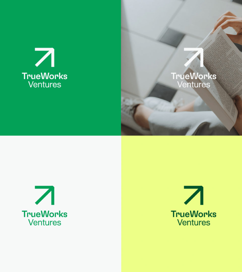
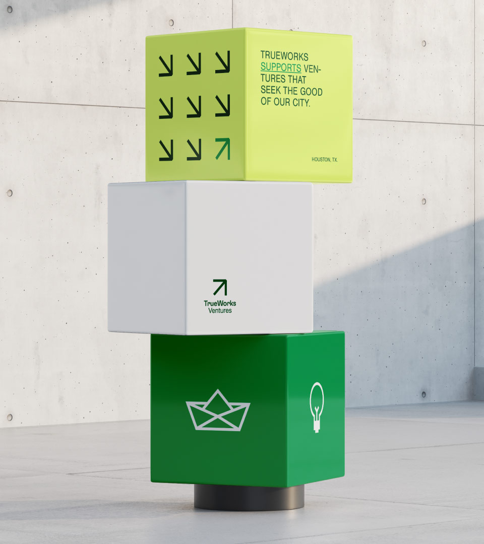
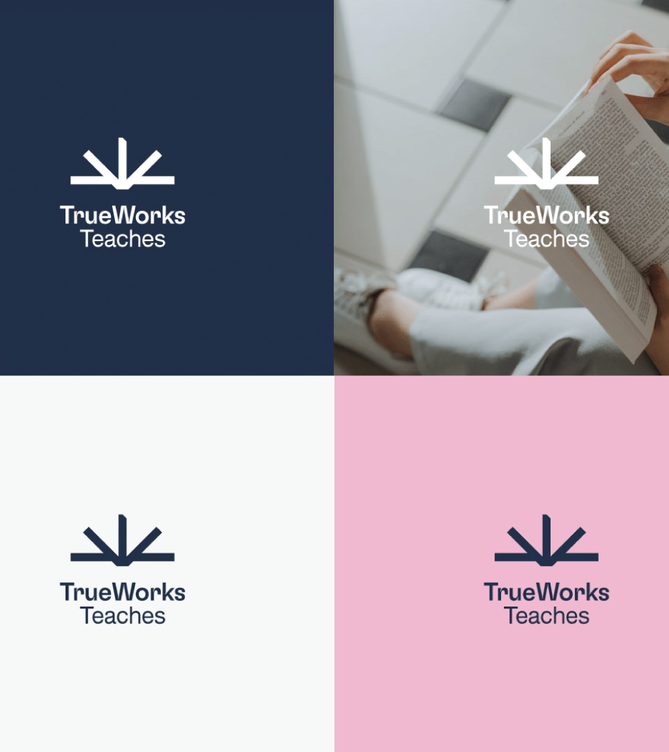
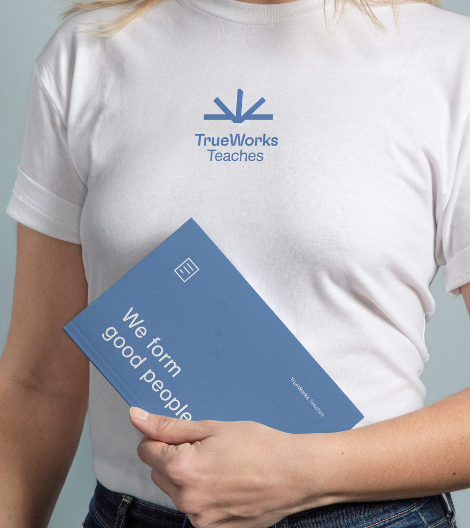
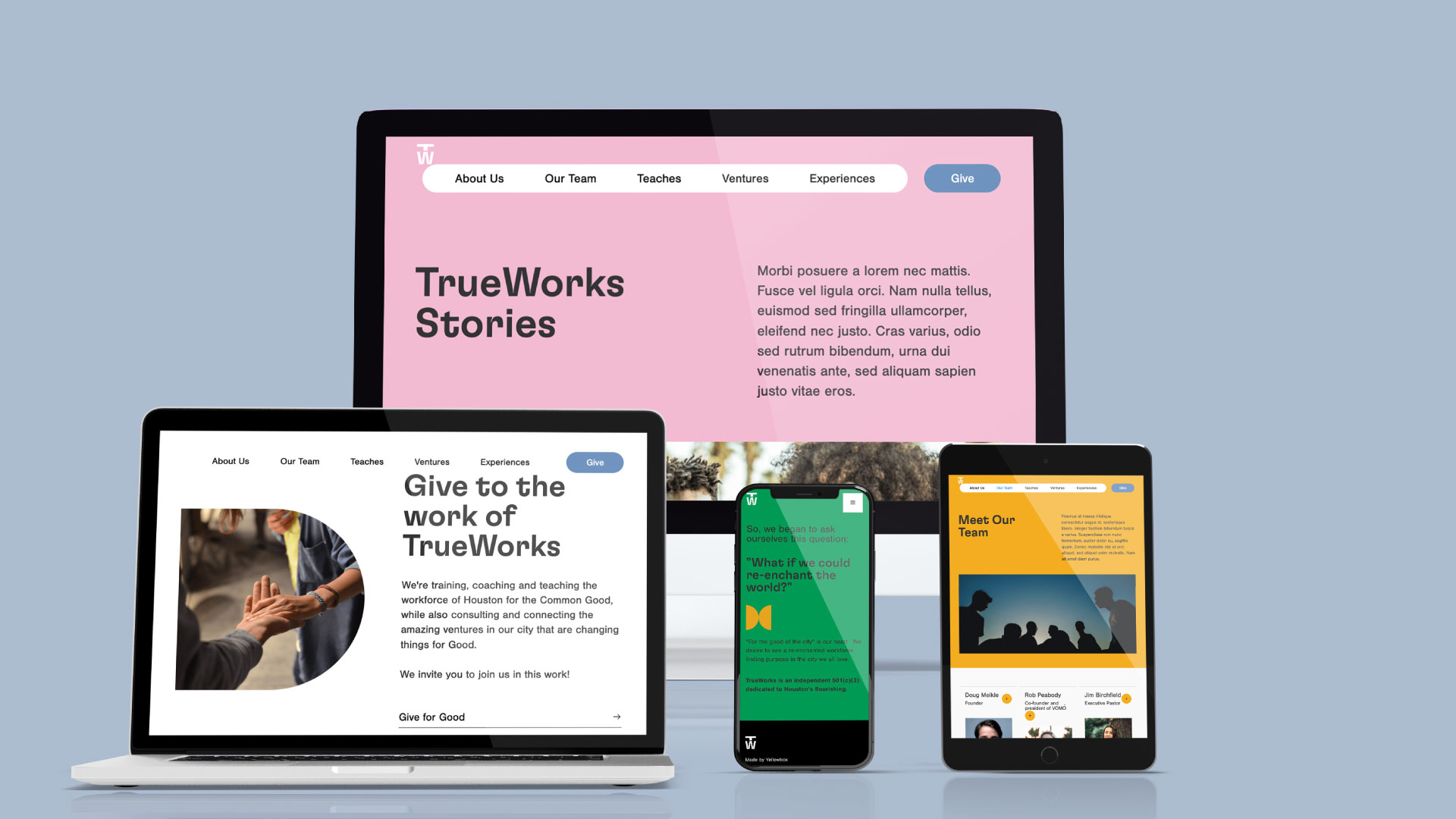
We partnered with TrueWorks to deliver a full organizational branding project that established a strong, cohesive identity while also creating clear alignment for its two sub-brands, TrueWorks Teaches and TrueWorks Ventures. The new visual identity balances professionalism with approachability, built on a clean wordmark, modern typography, and a versatile color palette that communicates trust and energy. From there, we extended the system into the sub-brands: Teaches carries the clarity and openness of education-focused visuals, while Ventures adapts the brand with more dynamic accents to reflect innovation and growth. By anchoring all three in a shared design system—consistent typography, logo construction, and color family—we built a branded house that strengthens the TrueWorks story while allowing each extension to speak directly to its audience. The result is a unified yet flexible brand that equips TrueWorks to communicate its mission with clarity across every expression.